Creating Publication-Quality Graphics
Overview
Teaching: 60 min
Exercises: 20 minQuestions
How can I create and save publication-quality graphics in R?
Objectives
To be able to use ggplot2 to generate publication quality graphics.
To understand the basic grammar of graphics, including the aesthetics and geometry layers, adding statistics, transforming scales, and coloring or panelling by groups.
To understand how to save plots in a variety of formats
To be able to find extensions for
ggplot2to produce custom graphics
Plotting our data is one of the best ways to quickly explore it and the various relationships between variables.
There are three main plotting systems in R, the base plotting system, the lattice package, and the ggplot2 package.
Today we’ll be learning about the ggplot2 package, which is part of the tidyverse. It is the most effective for creating publication quality graphics. There are many extension packages for ggplot2, which make it easy to produce specialised types of graph, such as survival plots, geographic maps and ROC curves.
ggplot2 is built on the grammar of graphics, the idea that any plot can be expressed from the same set of components: a data set, a coordinate system, and a set of geoms–the visual representation of data points.
The key to understanding ggplot2 is thinking about a figure in layers. This idea may be familiar to you if you have used image editing programs like Photoshop, Illustrator, or Inkscape.
Let’s start off with an example, using our gapminder data:
ggplot(data = gapminder, aes(x = gdpPercap, y = lifeExp)) +
  geom_point()

So the first thing we do is call the ggplot function. This function lets R
know that we’re creating a new plot, and any of the arguments we give the
ggplot function are the global options for the plot: they apply to all
layers on the plot.
We’ve passed in two arguments to ggplot. First, we tell ggplot what data we
want to show on our figure, in this example the gapminder data we read in
earlier. For the second argument we passed in the aes function, which
tells ggplot how variables in the data map to aesthetic properties of
the figure, in this case the x and y locations. Here we told ggplot we
want to plot the “gdpPercap” column of the gapminder data frame on the x-axis, and
the “lifeExp” column on the y-axis.
By itself, the call to ggplot isn’t enough to draw a figure:
ggplot(data = gapminder, aes(x = gdpPercap, y = lifeExp))
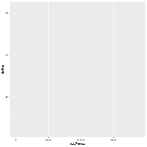
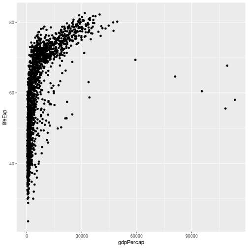
We need to tell ggplot how we want to visually represent the data, which we
do by adding a new geom layer. In our example, we used geom_point, which
tells ggplot we want to visually represent the relationship between x and
y as a scatter-plot of points:
ggplot(data = gapminder, aes(x = gdpPercap, y = lifeExp)) +
  geom_point()
Combining dplyr and ggplot2
As gplot2 is part of the tidyverse, we can use it with pipes. As we will see later in the
episode, this will be particularly useful if we need to modify the data before plotting it.
We can repeat the above plot, using a pipe, as follows:
gapminder %>% ggplot(aes(x = gdpPercap, y = lifeExp)) + geom_point()
 Note that the
 ggplot2 commands are joined by the + symbol and not the %>% symbol. It may help to remember that we add layers to our plot.
Challenge 1
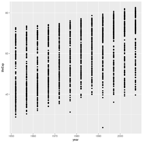
Modify the example so that the figure shows how life expectancy has changed over time. Note that using points to show this data isn’t the most effective way of presenting it; we will look at other ways of showing the data shortly.
Hint: the gapminder dataset has a column called “year”, which should appear on the x-axis.
Solution to challenge 1
Here is one possible solution:
gapminder %>% ggplot(aes(x = year, y = lifeExp)) + geom_point()
Challenge 2
In the previous examples and challenge we’ve used the
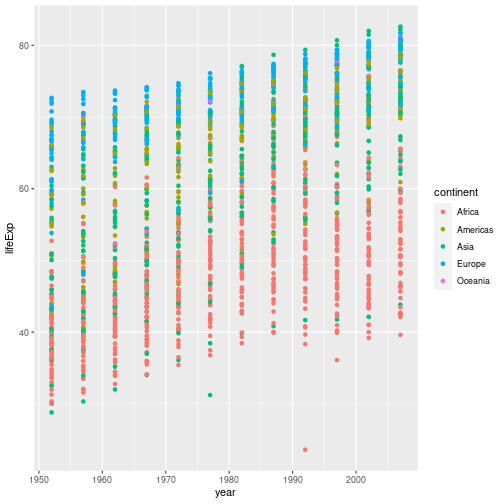
aesfunction to tell the scatterplot geom about the x and y locations of each point. Another aesthetic property we can modify is the point color. Modify the code from the previous challenge to color the points by the “continent” column. What trends do you see in the data? Are they what you expected?Solution to challenge 2
In the previous examples and challenge we’ve used the
aesfunction to tell the scatterplot geom about the x and y locations of each point. Another aesthetic property we can modify is the point color. Modify the code from the previous challenge to color the points by the “continent” column. What trends do you see in the data? Are they what you expected?gapminder %>% ggplot(aes(x = year, y = lifeExp, color = continent)) + geom_point()
Layers
Using a scatter-plot probably isn’t the best for visualizing change over time.
Instead, let’s tell ggplot to visualize the data as a line plot. If we replace geom_point() with
geom_line(), we obtain:
gapminder %>% ggplot(aes(x = year, y = lifeExp, colour = continent )) + geom_line()
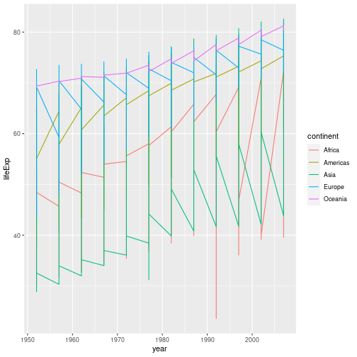
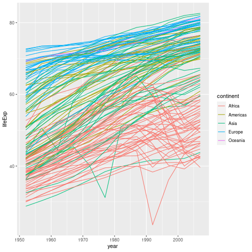
This probably isn’t what you were expecting. We need to modify the aesthetic to tell
ggplot that each country’s data should be a separate line. By default, geom_point()
joins all our observations together, sorting them in order of the variable we’re plotting
on the x axis. To generate a separate line for each country, we use the group aesthetic:
gapminder %>%  ggplot(aes(x = year, y = lifeExp, group = country, color = continent)) +
  geom_line()
But what if we want to visualize both lines and points on the plot? We can add another layer to the plot:
gapminder %>% ggplot(aes(x = year, y = lifeExp, group = country, color = continent)) +
  geom_line() + geom_point()
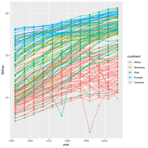
At the moment the aesthetic we defined applies to all of the plot layers; both the points
and the lines are coloured according to their continent. We can apply an aesthetic to certain layers
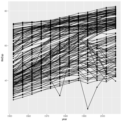
the plot by supplying them with their own aesthetic. For example, if we remove the color option, we aren’t
mapping any aspect of the data to the colour property of any part of the graph - all the points and lines have the same
colour:
gapminder %>% ggplot(aes(x = year, y = lifeExp, group = country)) +
  geom_line() + geom_point()
If we apply the aesthetic aes(colour=continent) to geom_line(), the (lack of) mapping of colour
is overridden by the new aesthetic. The points’ colours are unchanged:
gapminder %>% ggplot(aes(x = year, y = lifeExp, group = country)) +
  geom_line(aes(colour=continent)) + geom_point()

What if we want to print our points in a colour other than the default black? Aesthetics map data to a property of the graph. If we want to change the colour of all our points, we are not using the data to specify the colour, so we specify the colour directly in the geom:
gapminder %>%
  ggplot(aes(x = year, y = lifeExp, group = country)) +
  geom_line(aes(colour = continent)) +
  geom_point(colour = "red")
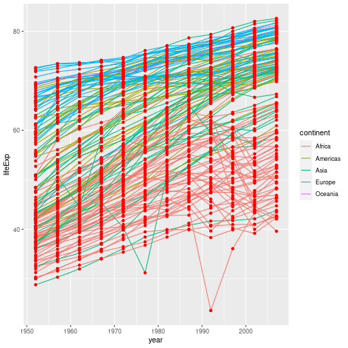
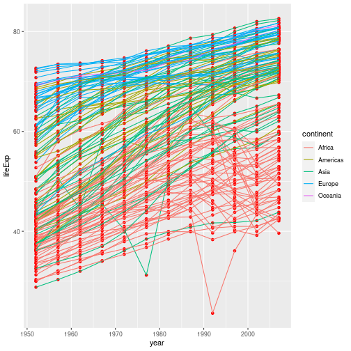
It’s important to note that each layer is drawn on top of the previous layer. In
this example, the points have been drawn on top of the lines. If we swap the order
of our geom_line() and geom_point(), the points appear behind the lines:
gapminder %>%
  ggplot(aes(x = year, y = lifeExp, group = country)) +
  geom_point(colour = "red") +
  geom_line(aes(colour = continent))
Tip: Transparency
If you have a lot of data or many layers, it can be useful to make some (semi)-transparent. You can do this by setting the
alphaproperty to a value between 0 (fully transparent), and 1 (fully opaque).
Multi-panel figures
There’s still a lot going on in this graph. It may clearer if we plotted a separate graph for each continent. We can split the plot into multiple panels by adding a layer of facet panels:
gapminder %>% ggplot(aes(x = year, y = lifeExp, group = country)) +
  geom_line() + facet_wrap("continent")
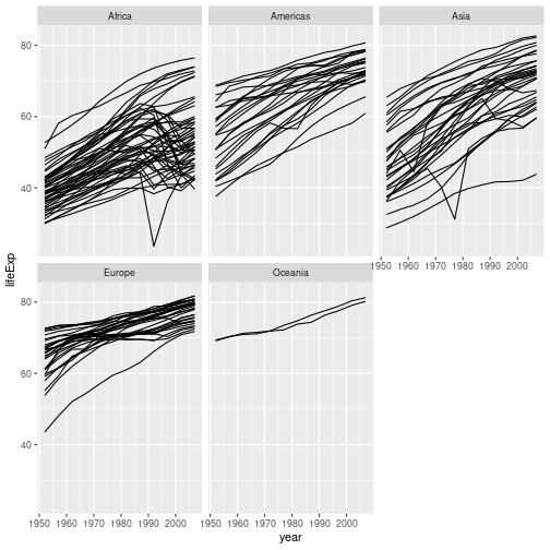
We have removed
colour=continent from the aesthetic since colouring each line by continent conveys no additional
information. Note that the variable we are faceting by needs to be placed in quotes.
More on faceting
It’s also possible to facet by one or two variables on a grid, using the
facet_grid()function. For example, we could plot life GDP per capita’s relationship to life expectancy for each combination of continent and year using the following code:gapminder %>% ggplot(aes(x=lifeExp, y=gdpPercap)) + geom_point(size=0.3) + facet_grid(continent ~ year)
This uses R’s formula notation to specify how we want to arrange to grid; see
?facet_gridfor more details.
Challenge 3
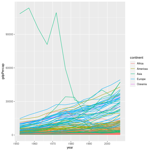
In this challenge you will explore how each country’s GDP per capita has changed with time.
Try two different approaches to visualising this data:
- Plot all the data on a single graph, colouring each country’s data by continent
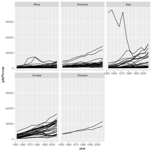
- Facet the data by continent.
Solution to challenge 3
- Plot all the data on a single graph, colouring each country’s data by continent
gapminder %>%
  ggplot(aes(x = year, y = gdpPercap, group = country, colour = continent)) +
  geom_line()
- Facet the data by continent.
gapminder %>%
  ggplot(aes(x = year, y = gdpPercap, group = country)) +
  geom_line() +
  facet_wrap("continent")
This representation of the data is arguably clearer. Neither graph is ideal though; the huge range of GDPs per capita makes it difficult to show the data on the same graph. We will look at transforming the scales of our axes shortly.
Another approach is to allow each facet to have its own scale on the y axis. This can be done by passing the
scales = "free_y"option tofacet_wrap(). This can be useful in some circumstances. It does, however, make it very difficult to compare data in different continents, and is arguably misleading.
Aside: Interactively exploring graphs
There are some outlying data points in the solution to challenge 3. You might be wondering which country these belong to. Unfortunately there isn’t an easy way of doing this neatly in ggplot2.
It is possible to use an additional library called plotly to convert a ggplot graph to a plotly graph. This is interactive, and will let you zoom in on areas of interest and hover over points to see a tooltip containing their values.
To do this, make your graph, and then run
library(plotly)to load the plotly library andggplotly()to convert the most recent ggplot graph to a plotly graph.(If you don’t have the plotly library installed on your machine, you can install it with
install.packages("plotly"))A pure ggplot2 approach is to use
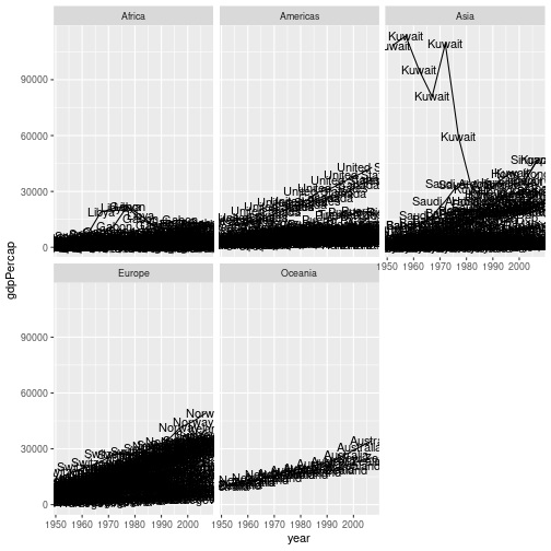
geom_text()to label each data point with the country (this uses thelabelaesthetic to select which variable in the data to use as the label):gapminder %>% ggplot(aes(x = year, y = gdpPercap, group = country, label = country)) + geom_line() + geom_text() + facet_wrap("continent")
The output from this clearly isn’t suitable for publication, but it may be sufficient if you just need to produce something for your own use.
The labels for each data point overlap each other, and are plotted for each data point. You can deal with the latter issue by creating a new variable which only contains the label for one point per group (i.e per country), and for the groups you wish to label. You can do this using
mutateandifelseas described at the end of the previous episode.
Pre processing data
When we want to start sub-setting and mutating the data before plotting, the usefulness of
“piped” data-analysis becomes apparent; we can perform our data transformations and then
send the result to ggplot2 without making an intermediate data set.
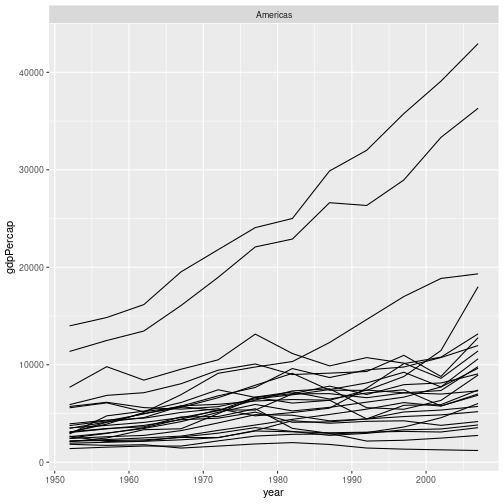
For example, if we wanted to produce a version of the graph in challenge 3, but only for countries in the Americas, we could use:
gapminder %>%
  filter(continent == "Americas") %>%
  ggplot(aes(x = year, y = gdpPercap, group = country)) +
  geom_line() +
  facet_wrap("continent")
Challenge 4
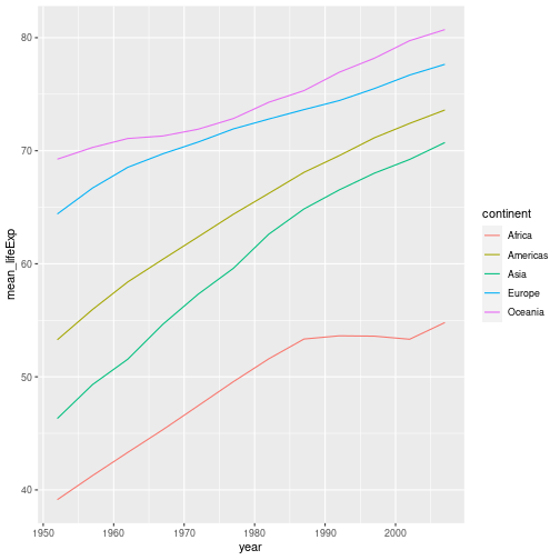
Rather than plotting the life expectancy of each country over time, make a plot showing the average life expectancy in each continent over time.
Hint - Challenge 3 of the previous episode may be useful. This can then be piped into a ggplot command.
Solution to challenge 4
gapminder %>%
  group_by(continent, year) %>%
  summarise(mean_lifeExp = mean(lifeExp)) %>%
  ggplot(aes(x = year, y=mean_lifeExp, colour = continent)) +
  geom_line()
`summarise()` has grouped output by 'continent'. You can override using the `.groups` argument.
Transformations
Ggplot also makes it easy to transform axes, to better show our data. To demonstrate we’ll go back to our first example:
gapminder %>% ggplot(aes(x = gdpPercap, y = lifeExp)) +
  geom_point()

Currently it’s hard to see the relationship between the points due to some strong outliers in GDP per capita. We can change the scale of units on the x axis using the scale functions. These control the mapping between the data values and visual values of an aesthetic. We also modify the transparency of the points, using the alpha function, which is especially helpful when you have a large amount of data which is very clustered.
gapminder %>% ggplot(aes(x = gdpPercap, y = lifeExp)) +
  geom_point(alpha = 0.5) + scale_x_log10()
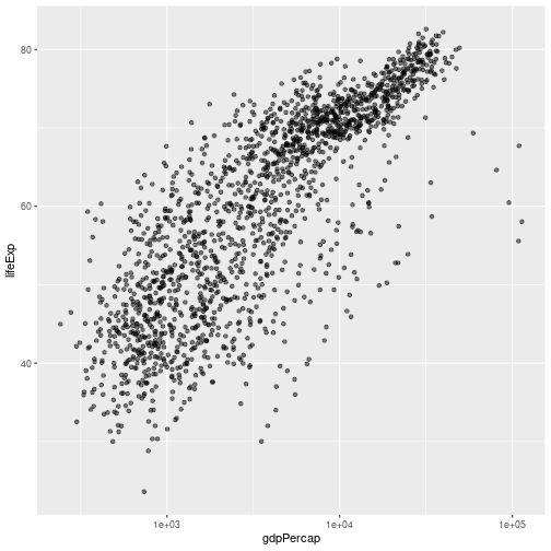
The scale_x_log10 function applied a transformation to the values of the gdpPercap
column before rendering them on the plot, so that each multiple of 10 now only
corresponds to an increase in 1 on the transformed scale, e.g. a GDP per capita
of 1,000 is now 3 on the x axis, a value of 10,000 corresponds to 4 on the x-
axis and so on. This makes it easier to visualize the spread of data on the
x-axis. If we want plot the y-axis on a log scale we can use the scale_y_log10 function.
Challenge 5
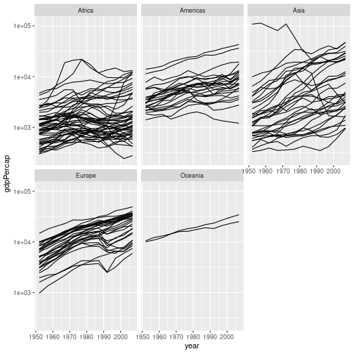
Modify the faceted plot you produced in challenge 3 to show GDP per capita on a log scale.
Solution to challenge 5
We can add the
scale_y_log10()to our plotting command:gapminder %>% ggplot(aes(x = year, y = gdpPercap, group = country)) + geom_line() + facet_wrap("continent") + scale_y_log10()
Although this makes it easier to visualise all of the data on a single plot, it makes the inequality in GDP per capita between the difference continents much less obvious.
If we plot the data with a linear scale the inequality is more obvious, but this masks the individual trajectories of many countries’ GDPs. Decisions about how best to plot data are beyond the scope of this course. Research IT offers a course, Introduction to data visualisation and analysis, which covers this topic in much more detail.
Plotting 1D data
In the examples so far we’ve plotted one variable against another. Often we wish to plot single variable. We can
plot counts using geom_bar(). For example, to plot the number of counties in the gapminder data that are in each
continent we can use:
gapminder %>% filter(year == 2007) %>%
  ggplot(aes(x=continent)) +
  geom_bar()
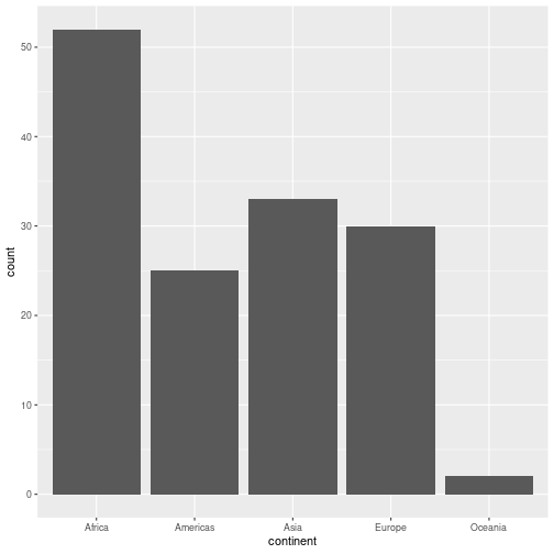
We filter to a single year of data to avoid multiple counting
We often wish to explore the distribution of a continuous variable. We can do this using a histogram (geom_histogram()),
or a density plot (geom_density())
For example, to produce a histogram of GDPs per capita for countries in Europe in 2007:
gapminder %>% filter(year == 2007, continent == "Europe") %>%
  ggplot(aes(x=gdpPercap)) + geom_histogram(bins = 10)
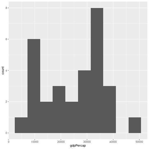
We can specify the number of bins (bins = ), or the width of a bin (binwidth = ).
We can plot a density plot using geom_density(). This is a smoothed version of a histogram.
gapminder %>%
  filter(year == 2007, continent == "Europe") %>%
  ggplot(aes(x = gdpPercap)) +
  geom_density()
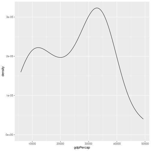
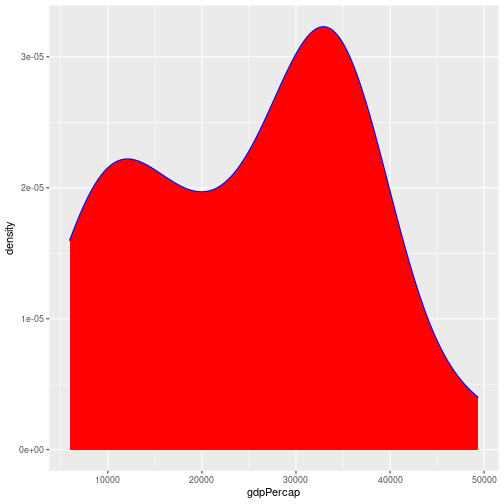
By default the density estimate is drawn in outline (i.e. it isn’t filled in). We can use the fill attribute to fill it in; this can be
passed in the aesthetic (e.g. aes(x = gdpPercap, fill = ...))) to fill according to the data, or directly to geom_density(). The colour attribute controls the outline of the shape. For example:
gapminder %>%
  filter(year == 2007, continent == "Europe") %>%
  ggplot(aes(x = gdpPercap)) +
  geom_density(fill = "red", colour="blue")
Challenge 6
In this challenge, we’ll extend the plot above to compare the distributions of GDP per capita in Europe and Africa over time. As the challenge is quite long, it’s broken down into sections. Please try each section before looking at the answer.
a. We’ll start off by plotting the data for a single year, before extending the plot for multiple years. Using the code above as a starting point, write some code to return a tibble containing the data for Europe and Africa in 2007. Hint: the
%in%operator may be useful.Solution a
gapminder %>%
  filter(year == 2007) %>%
  filter(continent %in% c("Europe", "Africa"))
# A tibble: 82 × 6 country year pop continent lifeExp gdpPercap <chr> <dbl> <dbl> <chr> <dbl> <dbl> 1 Albania 2007 3600523 Europe 76.4 5937. 2 Algeria 2007 33333216 Africa 72.3 6223. 3 Angola 2007 12420476 Africa 42.7 4797. 4 Austria 2007 8199783 Europe 79.8 36126. 5 Belgium 2007 10392226 Europe 79.4 33693. 6 Benin 2007 8078314 Africa 56.7 1441. 7 Bosnia and Herzegovina 2007 4552198 Europe 74.9 7446. 8 Botswana 2007 1639131 Africa 50.7 12570. 9 Bulgaria 2007 7322858 Europe 73.0 10681. 10 Burkina Faso 2007 14326203 Africa 52.3 1217. # … with 72 more rowsThis returns a tibble, which we can then pipe into ggplot.
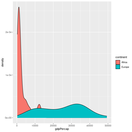
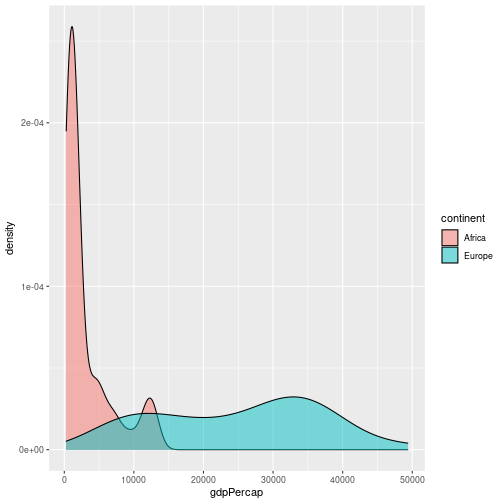
b. Pipe the results of part a into ggplot, to make a density plot of GDP per capita, setting the fill colour by continent (e.g. each continent has its own density estimate).
Solution b
gapminder %>%
  filter(year == 2007) %>%
  filter(continent %in% c("Europe", "Africa")) %>%
  ggplot(aes(x = gdpPercap, fill = continent)) +
  geom_density()
c. This looks OK, but the continent’s density estimates overlay each other. Use the
alpha =option to make each density estimate semi transparent.Solution c
gapminder %>%
  filter(year == 2007) %>%
  filter(continent %in% c("Europe", "Africa")) %>%
  ggplot(aes(x = gdpPercap, fill = continent)) +
  geom_density(alpha = 0.5)
d. Let’s take a look at how the relative GDPs per capita have changed over time. We can use
facet_wrap()to do this. Modify your code to produce a separate graph for each year.Solution d
gapminder %>%
  filter(continent %in% c("Europe", "Africa")) %>%
  ggplot(aes(x = gdpPercap, fill = continent)) +
  geom_density(alpha = 0.5) +
  facet_wrap("year")
Note that you need to remove the
filter(year == 2007)line from the code.
Modifying text
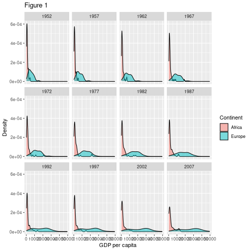
To clean this figure up for a publication we need to change some of the text elements. For example the axis labels should be “human readable” rather than the variable name from the data-set. We may also wish to change the text size, etc.
We can do this by adding a couple of different layers. The theme layer
controls the axis text, and overall text size. Labels for the axes, plot
title and any legend can be set using the labs function. Legend titles
are set using the same names we used in the aes specification; since we used the fill property to
colour by continent we use fill = "Continent in the labs() function.
gapminder %>%
  filter(continent %in% c("Europe", "Africa")) %>%
  ggplot(aes(x = gdpPercap, fill = continent)) +
  geom_density(alpha = 0.5) +
  facet_wrap("year") +
  labs(
    x = "GDP per capita", # x axis title
    y = "Density",   # y axis title
    title = "Figure 1",      # main title of figure
    fill = "Continent"      # title of legend
  )
RStudio provides a really useful cheat sheet of the different layers available, and more extensive documentation is available on the ggplot2 website.
Saving plots
Having produced a plot, we can save it, or copy it to the clipboard using the “Export” command at the top of RStudio’s plot window.
It’s a better idea to save your plots as part of your scripts; this way if you modify your analysis code, you know the plot will reflect the results of the code. If you manually save the plot, you have to remember to do this after changing the script.
We can save the most recently produced ggplot using the ggsave() function:
ggsave("plots/myplot.png")
# Can also set the size of plot
ggsave("plots/myplot.pdf", width = 20, height = 20, units = "cm")
The help for the ggsave() function lists the image formats that are available, as well as the options for setting the resolution and size of the saved image.
ggplot themes and extensions
ggplot is very flexible, and its capabilities can be extended.
The theme of a plot affects the background, axes etc. The ggplot2 themes package contains many useful (and not so useful) themes we can apply to our data. The cowplot package makes it easy to plot sub-plots, and to overlay plots within plots.
The ggplot2 exensions pages lists R packages that can extend its capabilities. If you have a specialised plotting need (for example plotting ROC curves, survival data, or time series) there are packages that will allow you to make these plots with minimal effort. The top 50 ggplot2 visualisations page provides examples (with full code) of almost any type of graph you might want to make.
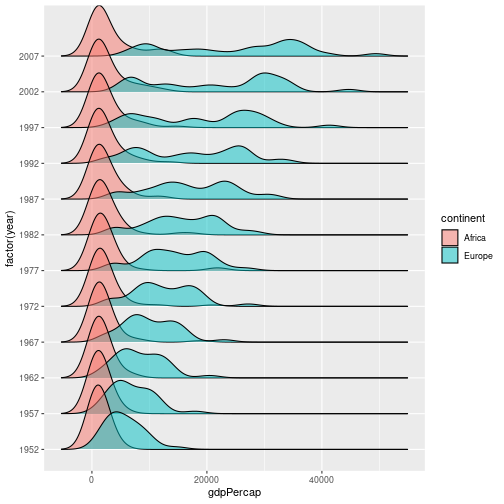
As an example of how easy it can be to extend ggplot, we will use the ggridges plot to produce a stacked density plot, to better visualise the previous figure:
library(ggridges)
gapminder %>%
  filter(continent %in% c("Europe", "Africa")) %>%
  ggplot(aes(x = gdpPercap, y = factor(year), fill = continent)) +
  geom_density_ridges(alpha = 0.5)
Picking joint bandwidth of 1850
Data Visualization - A practical Introduction is an online book which covers good practice in data visualisation, using R and ggplot2 to illustrate this.
Key Points
Use
ggplot2to create plots.We can feed the output of a
dplyrpipe intoggplot2to pre-process dataPlots are built up using layers: aesthetics, geometry, statistics, scale transformation, and grouping.
