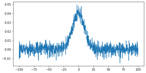
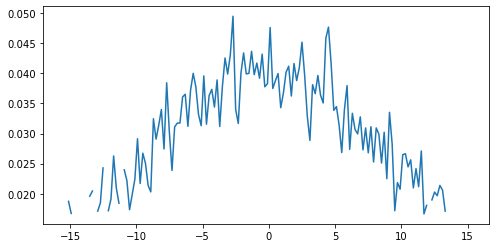
Image 1 of 1: ‘Gaussian curve plot, with random noise added’
Figure 4
Image 1 of 1: ‘Gaussian curve plot, with only data above threshold plotted’
Figure 5
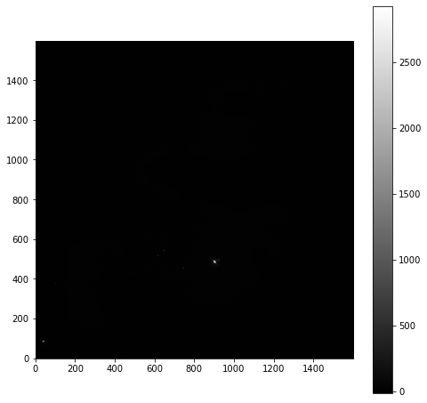
Image 1 of 1: ‘Nebulae image in greyscale. Mostly black background, with two small white dots.’
Figure 6
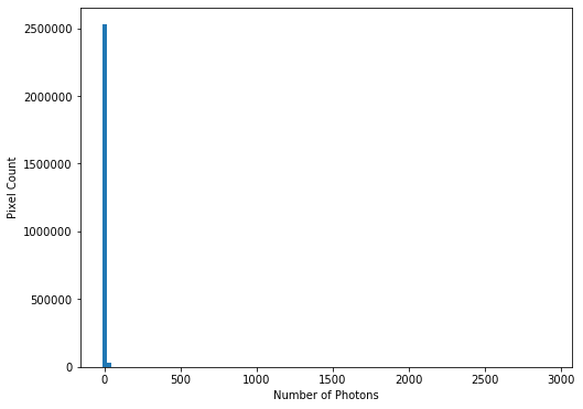
Image 1 of 1: ‘Histogram showing photon count, with (almost) all values around 0.’
This confirms our suspicions that many pixels have very low photon
counts.
Figure 7
Image 1 of 1: ‘Histogram showing photon count, with a log scale showing the long tail of high values.’
Figure 8
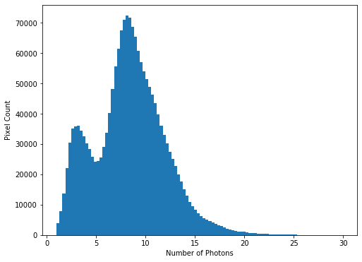
Image 1 of 1: ‘Histogram showing photon counts between 1 and 30’
We see that
there is a bi-modal distribution, with the largest peak around 8-9
photons, and a smaller peak around 3-4 photons.
Figure 9
Image 1 of 1: ‘Nebulae image in greyscale, with a photon count limit of 25. Collage of images showing the shape of the nebulae’
Figure 10
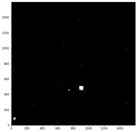
Image 1 of 1: ‘Nebulae mask image in greyscale, with a photon count limit of 25. A black background, with a few bright dots where the limit is exceeded.’
Figure 11
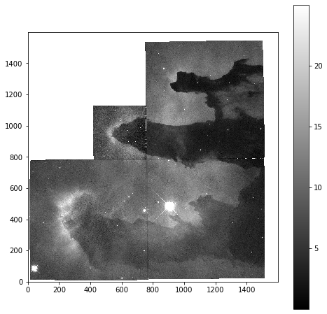
Image 1 of 1: ‘Nebulae image in greyscale, with a photon count limits of greater than 0 and less than 25. Collage of images showing the shape of the nebulae, and removing parts of the image where no data was collected.’
There are some unit conversions that would initially appear to be
unconvertible. For example, it is possible to convert meters into Hertz.
At first glance it seems to be wrong but if you know the quantities for
wavelength and frequencies, it is indeed a valid conversion:
where:
Figure 2
Image 1 of 1: ‘Plot of sin curve for degrees between 0-180’
Note that the units
for the x-axis are properly presented. This can be done for any angular
unit we wish:
Figure 3
Image 1 of 1: ‘Plot of sin curve for degrees between 0-180’
 This confirms our suspicions that many pixels have very low photon
counts.
This confirms our suspicions that many pixels have very low photon
counts.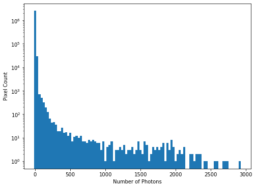
 We see that
there is a bi-modal distribution, with the largest peak around 8-9
photons, and a smaller peak around 3-4 photons.
We see that
there is a bi-modal distribution, with the largest peak around 8-9
photons, and a smaller peak around 3-4 photons.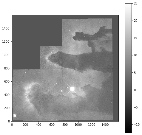
 where:
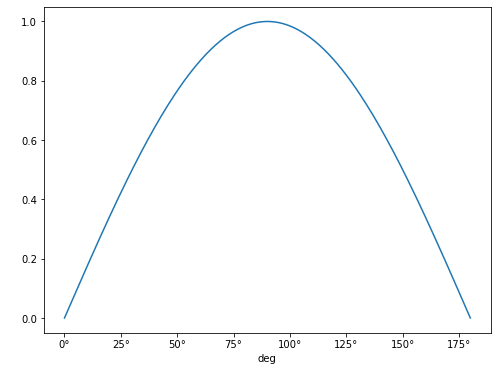 Note that the units
for the x-axis are properly presented. This can be done for any angular
unit we wish:
Note that the units
for the x-axis are properly presented. This can be done for any angular
unit we wish: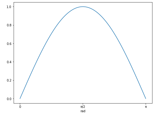
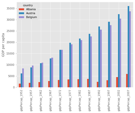
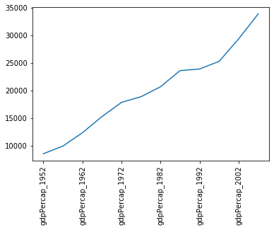 Note that we’ve had to rotate the xtick labels by 90 degrees, because
they do not fit neatly under the x-axis. Later we will clean these up
properly.
Note that we’ve had to rotate the xtick labels by 90 degrees, because
they do not fit neatly under the x-axis. Later we will clean these up
properly.