Creating Publication-Quality Graphics
Overview
Teaching: 60 min
Exercises: 20 minQuestions
How can I create and save publication-quality graphics in R?
Objectives
To be able to use ggplot2 to generate publication quality graphics.
To understand the basic grammar of graphics, including the aesthetics and geometry layers, adding statistics, transforming scales, and colouring or panelling by groups.
To understand how to save plots in a variety of formats
To be able to find extensions for
ggplot2to produce custom graphics
Plotting our data is one of the best ways to quickly explore it and the various relationships between variables. For example in the last challenge of the previous episode we calculated the number of times each word was used on each day in January. Until we plot the data it is very difficult to get a feel for what’s happening. Are some words becoming more prevalent? Is there a weekly cycle, with some words being more or less prevalent on certain days of the week?
There are three main plotting systems in R, the base plotting system, the lattice package, and the ggplot2 package.
Today we’ll be learning about the ggplot2 package, which is part of the tidyverse. It is the most effective for creating publication quality graphics. There are many extension packages for ggplot2, which make it easy to produce specialised types of graph, such as survival plots, geographic maps and ROC curves.
ggplot2 is built on the grammar of graphics, the idea that any plot can be expressed from the same set of components: a data set, a coordinate system, and a set of geoms–the visual representation of data points.
The key to understanding ggplot2 is thinking about a figure in layers. This idea may be familiar to you if you have used image editing programs like Photoshop, Illustrator, or Inkscape.
Let’s start off with an example, using our Twitter data. The data-set we’ve been working with so far today is rather large. Although ggplot2 can plot large data-sets, it will be easier to explain what it’s doing if we use a smaller data-set.
The file monthlyBae.csv contains the number of times “bae” was used in each state in each month (in the cases column), and the proportion of the total tokens (words) used in each state in each month (in the tokenProp column).
Let’s read the data in, using read_csv():
monthlyData <- read_csv("data/monthlyBae.csv")
Parsed with column specification:
cols(
  word = col_character(),
  monthyear = col_date(format = ""),
  stateCode = col_character(),
  Region = col_character(),
  cases = col_integer(),
  totalTokens = col_integer(),
  tokenProp = col_double()
)
The guessed column types look OK, so we’ll use the col_types argument to specify them
monthlyData <- read_csv("data/monthlyBae.csv",
                        col_types =
                          cols( word = col_character(),
                                monthyear = col_date(format = ""),
                                stateCode = col_character(),
                                Region = col_character(),
                                cases = col_integer(),
                                totalTokens = col_integer(),
                                tokenProp = col_double()
                          ))

monthlyData
# A tibble: 658 x 7
   word  monthyear  stateCode Region    cases totalTokens tokenProp
   <chr> <date>     <chr>     <chr>     <int>       <int>     <dbl>
 1 bae   2013-10-01 AL        South      1617     6227779 0.000260
 2 bae   2013-10-01 AR        South       213     1098699 0.000194
 3 bae   2013-10-01 AZ        West       1035     7809649 0.000133
 4 bae   2013-10-01 CA        West       5414    48481607 0.000112
 5 bae   2013-10-01 CO        West        193     4082344 0.0000473
 6 bae   2013-10-01 CT        Northeast   520     4880456 0.000107
 7 bae   2013-10-01 DE        South        54      424837 0.000127
 8 bae   2013-10-01 FL        South      3991    22522717 0.000177
 9 bae   2013-10-01 GA        South      3061    11400119 0.000269
10 bae   2013-10-01 IA        Midwest     335     2719798 0.000123
# ... with 648 more rows
All of the data for each month has been aggregated into a single row. R doesn’t have a data-type for dates that are just a month and a year, so I’ve arbitrarily used the first of the month as a “place-holder”.
To illustrate ggplot, I’ll generate an example graph. Don’t worry about what the code is doing at this stage; I’ll pull the command apart after:
  ggplot(monthlyData, aes(x = monthyear, y = cases)) +
  geom_point()

So the first thing we do is call the ggplot function. This function lets R
know that we’re creating a new plot, and any of the arguments we give the
ggplot function are the global options for the plot: they apply to all
layers on the plot.
We’ve passed in two arguments to ggplot. First, we tell ggplot what data we
want to show on our figure, in this example the monthly Twitter data we just read in. For the second argument we passed in the aes function, which
tells ggplot how variables in the data map to aesthetic properties of
the figure (i.e. something we can see on the graph), in this case the x and y locations. Here we told ggplot we
want to plot the “date” column of the Twitter data on the x-axis, and
the “cases” column on the y-axis.
By itself, the call to ggplot isn’t enough to draw a figure:
ggplot(monthlyData, aes(x = monthyear, y = cases))
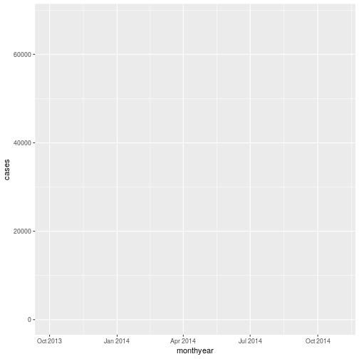
We need to tell ggplot how we want to visually represent the data, which we
do by adding a new geom layer. In our example, we used geom_point, which
tells ggplot we want to visually represent the relationship between x and
y as a scatter-plot of points. Each row in our tibble causes a single point to be drawn:
ggplot(monthlyData, aes(x = monthyear, y = cases)) +
  geom_point()

Combining dplyr and ggplot2
As gplot2 is part of the tidyverse, we can use it with pipes. As we will see later in the
episode, this will be particularly useful if we need to modify the data before plotting it.
We can repeat the above plot, using a pipe, as follows:
monthlyData %>%
  ggplot(aes(x = monthyear, y = cases)) +
  geom_point()
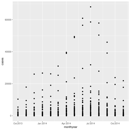 Note that the
 ggplot2 commands are joined by the + symbol and not the %>% symbol. It may help to remember that we add layers to our plot.
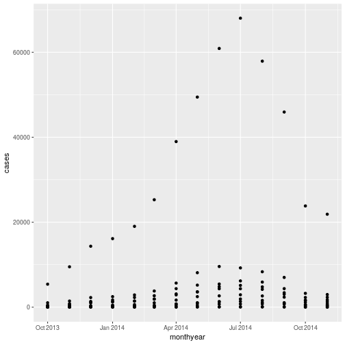
There are a couple of benefits to using pipes with ggplot. The first is that RStudio can normally work out what variables are in the tibble you’re piping to ggplot, and so the Tab completion will work. We can also use a processing pipeline to pre-process our data. For example, if we only want to look at how the prevalence of “bae” varied in states in the western region, we could use
monthlyData %>%
  filter(Region == "West") %>%
  ggplot(aes(x = monthyear, y = cases)) +
  geom_point()
Challenge 1
Plotting the number of times “bae” was used may not be the most sensible approach, as it does not take account of the difference in the amount of Twitter use in the different states.
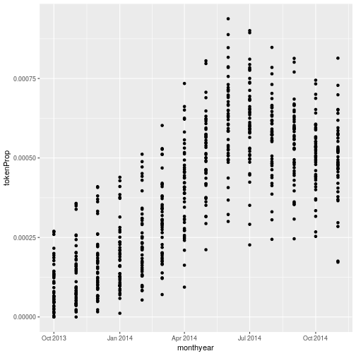
tokenPropcontains the proportion of all tokens (essentially words) used in each state that were “bae”.Modify the graph so that it plots
tokenPropinstead ofcaseson the y axis.Solution to challenge 1
monthlyData %>%
  ggplot(aes(x = monthyear, y = tokenProp)) +
  geom_point()
The
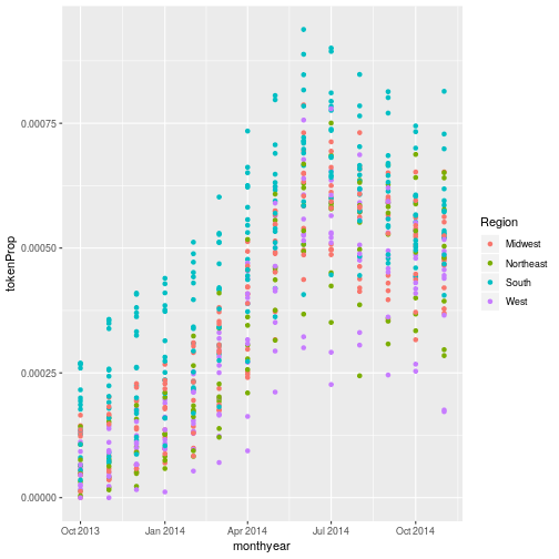
aes()function maps a visual property of the graph (for example what’s on the y axis) to a variable in the data. Another visual property of the graph we can change is the point colour. Modify the aesthetic on your graph so that the colour (or color - ggplot accepts either spelling) of the points depends on the regionSolution to challenge 1 (part 2)
We can colour the points according to the region by adding
colour = Regionto the aesthetic:monthlyData %>% ggplot(aes(x = monthyear, y = tokenProp, colour = Region)) + geom_point()
Joining the dots
Plotting this data using points (with geom_point()) doesn’t show the data to best effect. It would be more useful if we could follow the prevalence of each state over time. geom_line() lets us do this.
Replacing geom_point() with geom_line() in the solution to the previous challenge gives:
monthlyData %>%
  ggplot(aes(x = monthyear, y = tokenProp, colour = Region)) +
  geom_line()
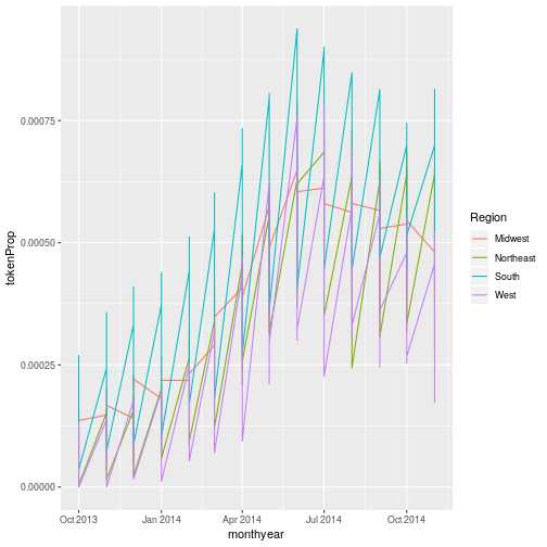
This probably isn’t quite what you were expecting. ggplot has drawn a single line for each region, rather than a single line for each state. We need to tell ggplot that each state is a separate group. The property of the graph is group. The data associated with each stateCode is in the same group (if we plotted a the data for a single state we would expect a single line). We modify the aesthetic function to include this mapping:
monthlyData %>%
  ggplot(aes(x = monthyear, y = tokenProp,
             colour = Region, group = stateCode)) +
  geom_line()
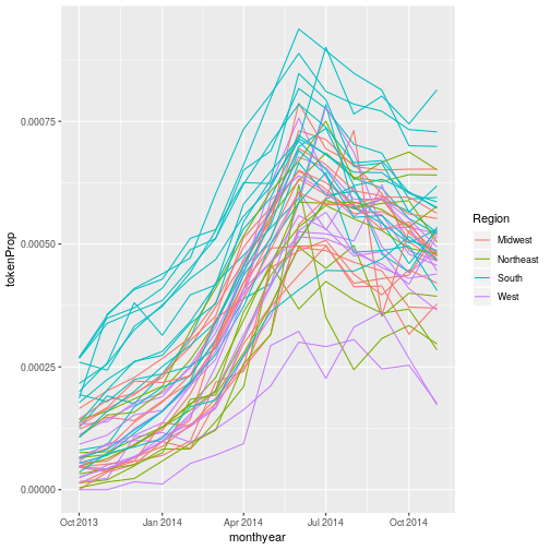
We can see the aesthetics (x, y, group, etc.) that each geom_ function uses by looking at its help page. As with any R function, enter ?functonName() or use the search tab in the lower right window in RStudio to bring up the help.
RStudio also includes a really useful “cheat-sheet” which summarises the most common ggplot functions and their aesthetics; this can be found in the help menu.
Layers and aesthetics
We can include more than one layer in the graph by adding additional geoms. For example, to plot points and lines:
monthlyData %>%
  ggplot(aes(x = monthyear, y = tokenProp,
             colour = Region, group = stateCode)) +
  geom_line() +
  geom_point()
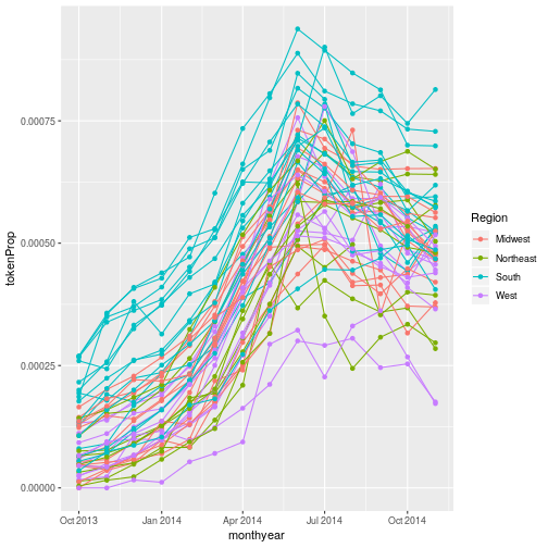 In the graph in challenge 2 the aesthetic we defined applies to all of the plot layers; both the points
and the lines are coloured according to their region. In this section we’ll explain how to modify the aesthetics of the graph so that they only apply to certain layers.
The most important thing to remember about aesthetics is that they map a variable in the data to a property of the graph. In the example above we mapped date to the x axis, tokenProp to the y axis and Region to the colour property of the graph.
The aesthetic defined in the ggplot() function can be thought of as the “master” aesthetic. The mappings of graph-property to variable we define in it will apply to all of the geoms in the graph. Both the points and lines are coloured according to region. We can define aesthetics in a more granular way by applying them to a specific geom. For example:
monthlyData %>%
  ggplot(aes(x = monthyear, y = tokenProp,
             group = stateCode)) +
  geom_line(aes(colour = Region)) +
  geom_point()
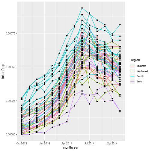
Here I’ve moved the colour property from the master aesthetic to a new aesthetic() in geom_line(). This overrides the master aesthetic’s colour property (which is undefined, so no colour is used) on geom_line(). geom_point() doesn’t have its own aesthetic, so it uses the master aesthetic - so the points appear in a single colour.
What if we want to print our points in a colour other than the default black? Aesthetics map data to a property of the graph. If we want to change the colour of all our points, we are not using the data to specify the colour, so we don’t need to use an aesthetic mapping. Instead we specify the colour directly in the geom:
monthlyData %>%
  ggplot(aes(x = monthyear, y = tokenProp,
             group = stateCode)) +
  geom_line(aes(colour = Region)) +
  geom_point(colour = "red")

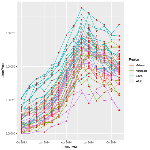
Each layer is drawn on top of the previous layer. In
this example, the points have been drawn on top of the lines. If we swap the order
of our geom_line() and geom_point(), the points appear behind the lines:
monthlyData %>%
  ggplot(aes(x = monthyear, y = tokenProp,
             group = stateCode)) +
  geom_point(colour = "red") +
  geom_line(aes(colour = Region))
Tip: Transparency
If you have a lot of data or many layers, it can be useful to make some (semi)-transparent. You can do this by setting the
alphaproperty to a value between 0 (fully transparent), and 1 (fully opaque).
Multi-panel figures
There’s still a lot going on in this graph. It may clearer if we plotted a separate graph for each region. We can split the plot into multiple panels by adding a layer of facet panels:
monthlyData %>%
  ggplot(aes(x = monthyear, y = tokenProp,
             group = stateCode)) +
  geom_point() +
  geom_line() +
  facet_wrap("Region")
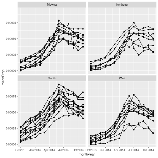
We have removed
colour=Region from the aesthetic since colouring each line by region conveys no additional
information. Note that the variable we are faceting by needs to be placed in quotes.
More on faceting
It’s also possible to facet by one or two variables on a grid, using the
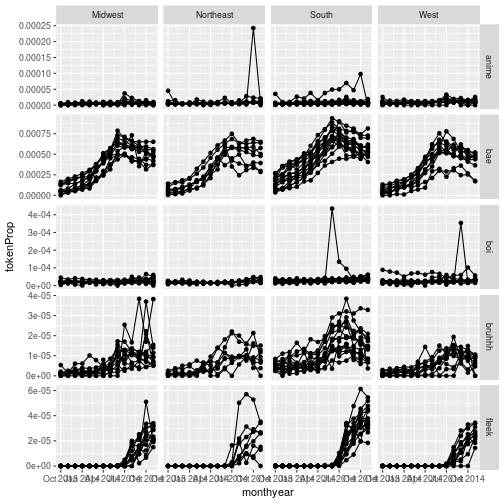
facet_grid()function. For example, if we had included all the words in our grouped data, we could produce a grid of graphs by word and region:(I’ve included the option
scale = "free_y"so that each row gets its own scale. I’ve done this because the prevalence of each word varies)monthlyDataAll <- read_csv("data/monthlyAll.csv")Parsed with column specification: cols( word = col_character(), monthyear = col_date(format = ""), stateCode = col_character(), Region = col_character(), cases = col_integer(), totalTokens = col_integer(), tokenProp = col_double() )monthlyDataAll %>% ggplot(aes(x = monthyear, y = tokenProp, group = stateCode)) + geom_point() + geom_line() + facet_grid(word ~ Region, scale = "free_y")
This uses R’s formula notation to specify how we want to arrange to grid; see
?facet_gridfor more details.
Challenge 3
In this challenge you will look at how the total number of tokens (e.g. words) tweeted varies with time.
Try two different approaches to visualising this data:
- Plot all the data on a single graph, colouring each state’s data by region
- Facet the data by region.
Solution to challenge 3
- Plot all the data on a single graph, colouring each state’s data by region
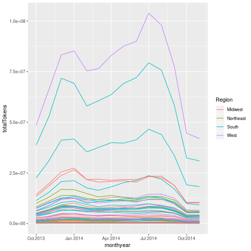
monthlyData %>%
  ggplot(aes(x = monthyear, y = totalTokens, colour = Region, group = stateCode)) +
  geom_line()
- Facet the data by region.
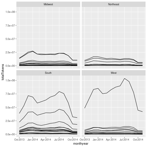
monthlyData %>%
  ggplot(aes(x = monthyear, y = totalTokens, group = stateCode)) +
  geom_line() +
  facet_wrap("Region")
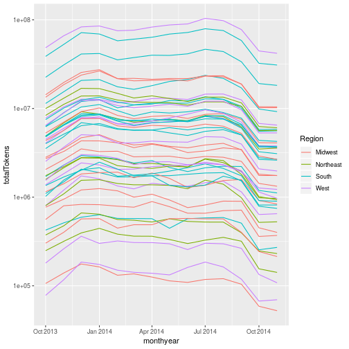
The much greater volume of tokens coming from the southern and western states makes it difficult to see what’s going on in the midwest and northeastern states (where the volume of tokens is much lower). One way of dealing with this is to allow each facet to have its own scale on the y axis. This can be done by passing the
scales = "free_y"option tofacet_wrap(). This can be useful in some circumstances. It does, however, make it very difficult to compare data in different continents, and is arguably misleading.Another approach is to use a log scale on the y axis. We’ll cover this shortly.
Aside: Interactively exploring graphs
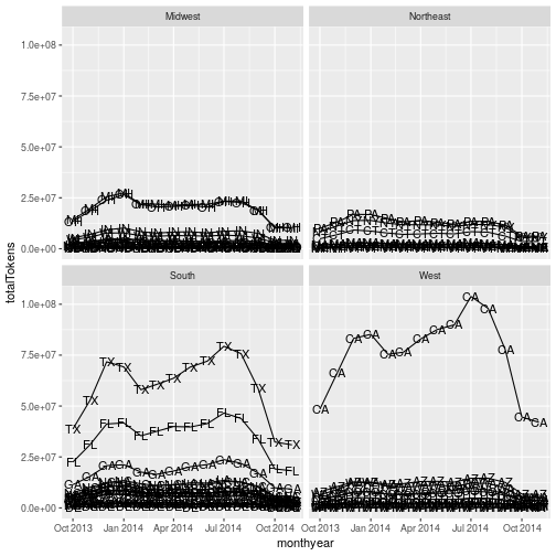
You might be wondering which states have the largest volume of tokens. Unfortunately isn’t an easy way of doing this neatly in ggplot2. One approach is to use
geom_text()to label each data point with the state (this uses thelabelaesthetic to select which variable in the data to use as the label): WmonthlyData %>% ggplot(aes(x = monthyear, y = totalTokens, group = stateCode, label = stateCode)) + geom_line() + geom_text() + facet_wrap("Region")
The output from this clearly isn’t suitable for publication, but it may be sufficient if you just need to produce something for your own use.
The labels for each data point overlap each other, and are plotted for each data point. You can deal with the latter issue by creating a new variable which only contains the label for one point per group (i.e per country), and for the groups you wish to label. You can do this using
mutateandifelseas described at the end of the previous episode.It’s also possible to make a graph with “tooltips”, so that the country pops up when you hover the mouse over a line.
ggplot2can’t do this automatically, but an extension package ggiraph` provides this functionality. The package’s documentation has full examples.
Transformations
Ggplot also makes it easy to transform axes, to better show our data.
Consider the graph we made just now, showing the total number of tokens in each state:
monthlyData %>%
  ggplot(aes(x = monthyear, y = totalTokens, colour = Region, group = stateCode)) +
  geom_line()

We can make the y axis have a log scale by adding scale_y_log10() to our plotting command:
monthlyData %>%
  ggplot(aes(x = monthyear, y = totalTokens, colour = Region, group = stateCode)) +
  geom_line() + scale_y_log10()
Final Challenge
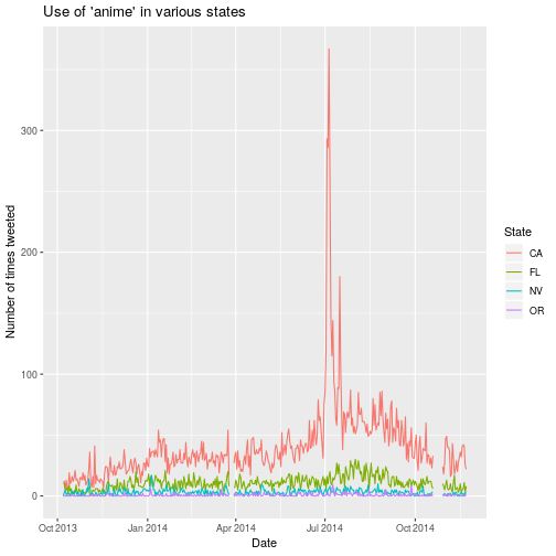
There was an anime expo in California during the period the Twitter data we’re using were collected. The aim of this challenge is to see whether we can see people talking about it. For this challenge you’ll need to use the daily data we were using. This is stored in the file
twitterData.csv.As the challenge is quite long it’s broken down into sections. Please try each section before looking at the answer.
Firstly, load the daily data, using
read_csv()Solution
twitterData <- read_csv("data/twitterData.csv")Parsed with column specification: cols( date = col_date(format = ""), stateCode = col_character(), word = col_character(), cases = col_integer(), dataDay = col_integer(), Region = col_character(), totalTokens = col_double(), State = col_character() )It’s a good idea to set the column types, as we did previously (though this isn’t essential). We can do this by adding the
col_typesargument, and cutting and pasting the column specification that’s output when we don’t specify column types:twitterData <- read_csv("data/twitterData.csv", col_types = cols( date = col_date(format = ""), stateCode = col_character(), word = col_character(), cases = col_double(), dataDay = col_double(), Region = col_character(), totalTokens = col_double(), State = col_character() ))The next thing to do is to filter the data so that we are only looking at data for the word “anime”
Solution
twitterData %>%
  filter(word == "anime")
# A tibble: 18,988 x 8 date stateCode word cases dataDay Region totalTokens State <date> <chr> <chr> <dbl> <dbl> <chr> <dbl> <chr> 1 2013-10-07 AL anime 0 1 South 184649 Alabama 2 2013-10-07 AR anime 0 1 South 23641 Arkansas 3 2013-10-07 AZ anime 1 1 West 198852 Arizona 4 2013-10-07 CA anime 11 1 West 1209652 Californ… 5 2013-10-07 CO anime 0 1 West 106166 Colorado 6 2013-10-07 CT anime 1 1 Northea… 149773 Connecti… 7 2013-10-07 DE anime 0 1 South 12039 Delaware 8 2013-10-07 FL anime 10 1 South 675243 Florida 9 2013-10-07 GA anime 4 1 South 363111 Georgia 10 2013-10-07 IA anime 0 1 Midwest 73405 Iowa # ... with 18,978 more rowsNow we want to plot how the number of
casesvaries withdatefor each state:Solution
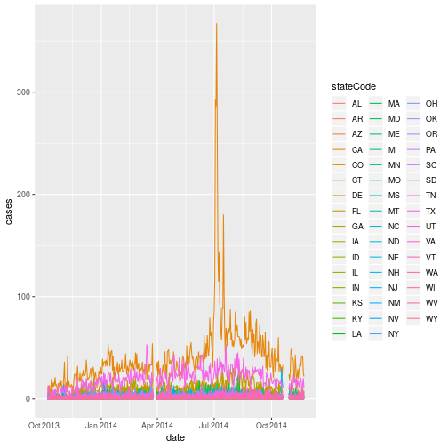
Using a pipe to send the output of the previous solution straight to ggplot:
twitterData %>%
  filter(word == "anime") %>%
  ggplot(aes(x = date,
             y = cases,
             colour = stateCode)) +
  geom_line()
Note that we don’t need to set the
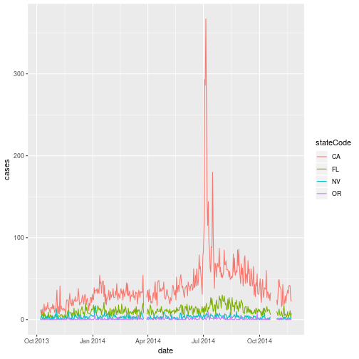
groupaesthetic here, since we’ve only got one set of data for each state.It’s probably clearer if we don’t show data on all the states. Modify you command to only show data for CAlifornia, ORegon NeVada and (as a comparator that’s far away), FLorida. Hint: the
%in%operator may be useful.Solution
twitterData %>%
  filter(word == "anime") %>%
  filter(stateCode %in% c("CA", "FL", "OR", "NV")) %>%
  ggplot(aes(x = date,
             y = cases,
             colour = stateCode)) +
  geom_line()
Modifying text
The final thing we’ll do in this session is to tidy up the figure we’ve just made. We need to change some of the text elements. For example the axis labels should be “human readable” rather than the variable name from the data-set.
We can do this by adding a couple of different layers. The theme layer
controls the axis text, and overall text size. Labels for the axes, plot
title and any legend can be set using the labs function. Legend titles
are set using the same names we used in the aes specification; since we used the colour property to
colour by state code we use colour = "State" in the labs() function.
twitterData %>%
  filter(word == "anime") %>%
  filter(stateCode %in% c("CA", "FL", "OR", "NV")) %>%
  ggplot(aes(x = date,
             y = cases,
             colour = stateCode)) +
  geom_line() +
  labs(
    x = "Date", # x axis title
    y = "Number of times tweeted",   # y axis title
    title = "Use of 'anime' in various states",      # main title of figure
    colour = "State"      # title of legend
  )
RStudio provides a really useful cheat sheet of the different layers available, and more extensive documentation is available on the ggplot2 website.
Saving plots
Having produced a plot, we can save it, or copy it to the clipboard using the “Export” command at the top of RStudio’s plot window.
It’s a better idea to save your plots as part of your scripts; this way if you modify your analysis code, you know the plot will reflect the results of the code. If you manually save the plot, you have to remember to do this after changing the script.
We can save the most recently produced ggplot using the ggsave() function:
ggsave("results/animePlot.png")
# Can also set the size and type of plot
ggsave("results/animePlot.pdf", width = 20, height = 20, units = "cm")
The help for the ggsave() function lists the image formats that are available, as well as the options for setting the resolution and size of the saved image.
ggplot themes and extensions
ggplot is very flexible, and its capabilities can be extended.
The theme of a plot affects the background, axes etc. The ggplot2 themes package contains many useful (and not so useful) themes we can apply to our data. The cowplot package makes it easy to plot sub-plots, and to overlay plots within plots.
The ggplot2 exensions pages lists R packages that can extend its capabilities. If you have a specialised plotting need (for example plotting ROC curves, survival data, or time series) there are packages that will allow you to make these plots with minimal effort. The top 50 ggplot2 visualisations page provides examples (with full code) of almost any type of graph you might want to make.
Data Visualization - A practical Introduction is an on-line book which covers good practice in data visualisation, using R and ggplot2 to illustrate this.
Key Points
Use
ggplot2to create plots.We can feed the output of a
dplyrpipe intoggplot2to pre-process dataPlots are built up using layers: aesthetics, geometry, statistics, scale transformation, and grouping.
