Plotting data
Last updated on 2023-08-21 | Edit this page
Overview
Questions
- “How can I visualize my data?”
Objectives
- “Display simple graphs with adequate titles and labels.”
- “Get familiar with functions
plot,heatmapandimagesc.” - “Learn how to show images side by side.”
Plotting
The mathematician Richard Hamming once said, “The purpose of computing is insight, not numbers,” and the best way to develop insight is often to visualize data. Visualization deserves an entire lecture (or course) of its own, but we can explore a few features of MATLAB here.
We will start by exploring the function plot. The most
common usage is to provide two vectors, like plot(X,Y).
Lets start by plotting the the average (accross patients) inflammation
over time. For the Y vector we can provide
per_day_mean, and for the X vector we can
simply use the day number, which we can generate as a range with
1:40. Then our plot can be generated with:
MATLAB
>> plot(1:40,per_day_mean)Callout
Note: If we only provide a vector as an argument it
plots a data-point for each value on the y axis, and it uses the index
of each element as the x axis. For our patient data the indices coincide
with the day of the study, so plot(per_day_mean) generates
the same plot. In most cases, however, using the indices on the x axis
is not desireable.
As it is, the image is not very informative. We need to give the
figure a title and label the axes using xlabel
and ylabel, so that other people can understand what it
shows (including us if we return to this plot 6 months from now).
MATLAB
>> title('Daily average inflammation')
>> xlabel('Day of trial')
>> ylabel('Inflammation')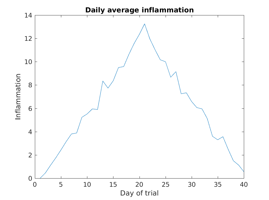
Much better, now the image actually communicates something.
The result is roughly a linear rise and fall, which is suspicious: based on other studies, we expect a sharper rise and slower fall. Let’s have a look at two other statistics: the maximum and minimum inflammation per day across all patients.
MATLAB
>> plot(per_day_max)
>> title('Maximum inflammation per day')
>> ylabel('Inflammation')
>> xlabel('Day of trial')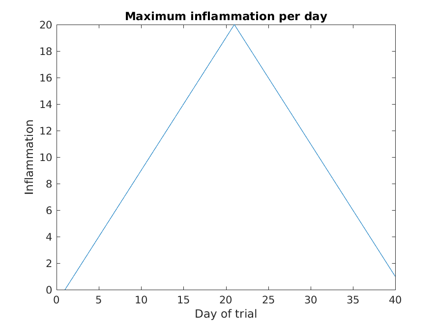
MATLAB
>> plot(per_day_min)
>> title('Minimum inflammation per day')
>> ylabel('Inflammation')
>> xlabel('Day of trial')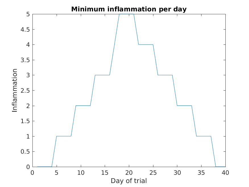
From the figures, we see that the maximum value rises and falls perfectly smoothly, while the minimum seems to be a step function. Neither result seems particularly likely, so either there’s a mistake in our calculations or something is wrong with our data.
Multiple lines in a plot
It is often the case that we want more than one line in a single
plot. In matlab we can “hold” a plot and keep plotting on top. For
example, we might want to contrast the mean values accross patients with
the information of a single patient. If we are displaying more than one
line, it is important we add a legend. We can specify the legend names
by adding ,'DisplayName',"legend name here" inside the plot
function. We then need to activate the legend by running
legend So, to plot the mean values we first do:
MATLAB
>> plot(per_day_mean,'DisplayName',"Mean")
>> legend
>> title('Daily average inflammation')
>> xlabel('Day of trial')
>> ylabel('Inflammation')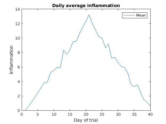
Then, we can use the instruction hold on to add a plot
for patient_5.
MATLAB
>> hold on
>> plot(patient_5,'DisplayName',"Patient 5")
>> hold off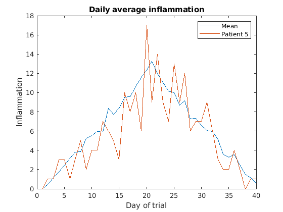
Remember to tell matlab you are done by adding hold off
when you are done!
Subplots
It is often convenient to combine multiple plots into one figure. The
subplot(m,n,p)command allows us to do just that. The first
two parameter define a grid of m rows and n
columns, in which our plots will be placed. The third parameter
indicates the position on the grid that we want to use for the “next”
plot command. For example, we can show the average daily min and max
plots together with:
MATLAB
>> subplot(1, 2, 1)
>> plot(per_day_max)
>> ylabel('max')
>> xlabel('day')

>> subplot(1, 2, 2)
>> plot(per_day_min)
>> ylabel('min')
>> xlabel('day')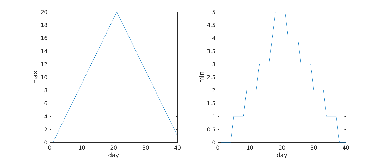
Heatmaps
If we wanted to look at all our data at the same time we need a three dimensions: One for the patients, one for the days, and another one for the inflamation values. An option is to use a heatmap, that is, use the colour of each point to represent the inflamation values.
In matlab, at least two methods can do this for us. The heatmap
function takes a table as input and produces a heatmap:
MATLAB
>> heatmap(patient_data)
>> title('Inflammation')
>> xlabel('Day of trial')
>> ylabel('Patient number')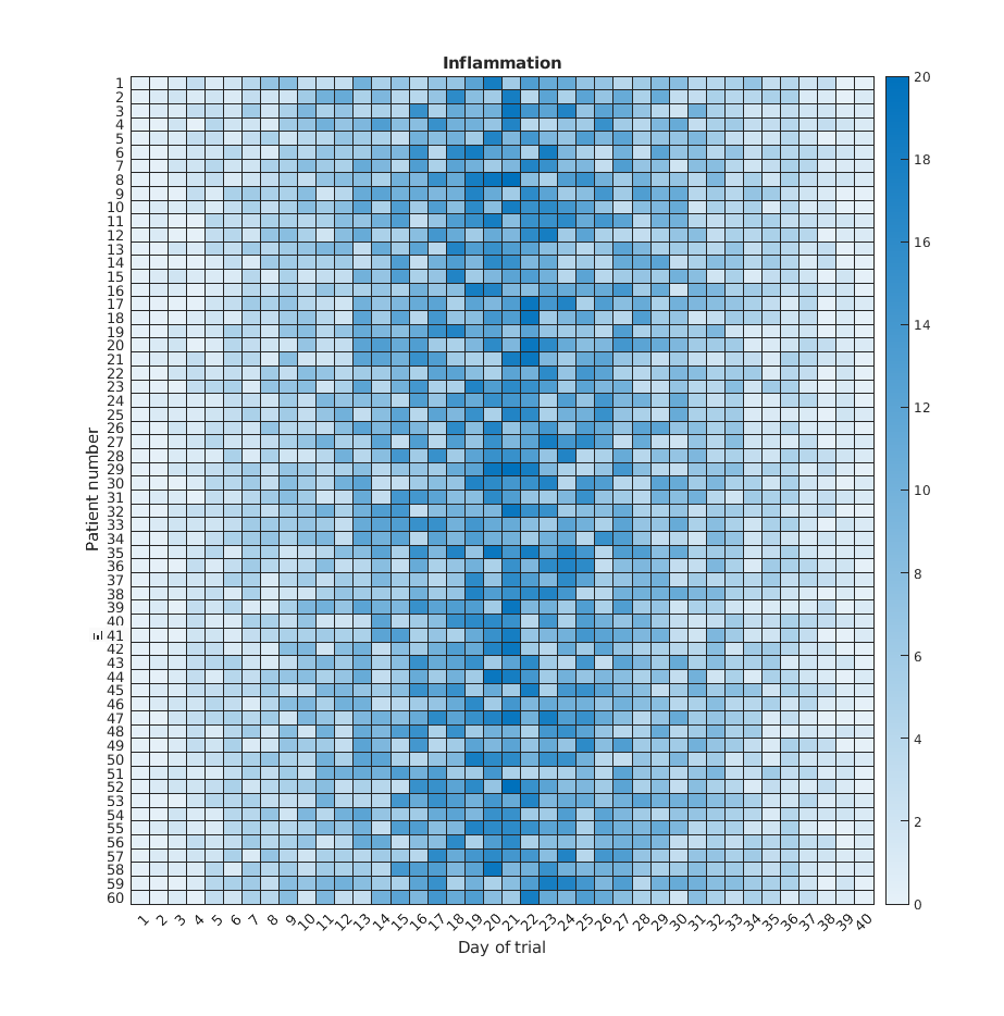
We gain something by visualizing the whole dataset at once, but it is harder to distinwish the overly linear rises and fall over a 40 day period.
Similarly, the imagesc
function represents the matrix as a color image.
MATLAB
>> imagesc(patient_data)
>> title('Inflammation')
>> xlabel('Day of trial')
>> ylabel('Patient number')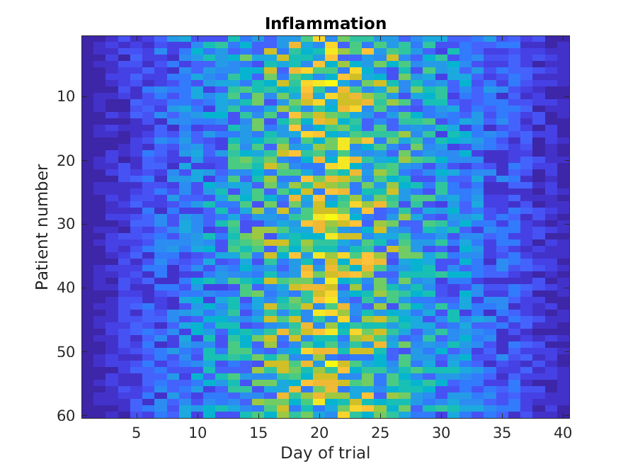
Every value in the matrix is mapped to a color. Blue regions in this heat map are low values, while yellow shows high values.
Both functions provide very similar information, and can be tweaked
to your liking. The imagesc function is usually only used
for purely numerical arrays, whereas heatmap can process tables
(that can have strings or categories in them). In our case, which one
you use is a matter of taste.
Is all our data corrupt?
Our work so far has convinced us that something is wrong with our first data file. We would like to check the other 11 the same way, but typing in the same commands repeatedly is tedious and error-prone. Since computers don’t get bored (that we know of), we should create a way to do a complete analysis with a single command, and then figure out how to repeat that step once for each file. These operations are the subjects of the next two lessons.
Keypoints
- “Use
plot(vector)to visualize data in the y axis with an index number in the x axis.” - “Use
plot(X,Y)to specify values in both axes.” - “Document your plots with
title('My title'),xlabel('My horizontal label')andylabel('My vertical label').” - “Use
hold onandhold offto plot multiple lines at the same time.” - “Use
legendand add,'DisplayName','legend name here'inside the plot function to add a legend.” - “Use
subplot(m,n,p)to create a grid ofmxnplots, and choose a positionpfor a plot.”